![]()
Visualization
In this notebook, we will introduce the different types of visualization available in tnetwork.
There are two types: visualization of graphs at particular time (e.g., a particular snapshot), and visualization of the evolution of the community structure (longitudinal visualization)
If tnerwork library is not installed, you need to install it, for instance using the following command
[1]:
#%%capture #avoid printing output
#!pip install --upgrade git+https://github.com/Yquetzal/tnetwork.git
[2]:
import tnetwork as tn
import seaborn as sns
import pandas as pd
import networkx as nx
import numpy as np
Let’s start with a toy example generated using tnetwork generator (see the corresponding documentation for details)
[3]:
my_scenario = tn.ComScenario()
[com1,com2] = my_scenario.INITIALIZE([6,6],["c1","c2"])
(com2,com3)=my_scenario.THESEUS(com2,delay=20)
my_scenario.DEATH(com2,delay=10)

(generated_network_IG,generated_comunities_IG) = my_scenario.run()
100% (8 of 8) |##########################| Elapsed Time: 0:00:00 ETA: 00:00:00
Cross-section visualization
One way to see a dynamic graph is to plot it as a series of standard static graph. We can start by plotting a single graph at a single time.
There are two libraries that can be used to render the plot: networkx (using matplotlib) or bokeh. matplotlib has the advantage of being more standard, while bokeh has the advantage of providing interactive graphs. This is especially useful to check who is each particular node or community in real datasets.
But Bokeh also has weaknesses: * It can alter the responsiveness of the netbook if large visualization are embedded in it * In some online notebooks e.g., google colab, embedding bokeh pictures in the notebook does not work well.
As a consequence, it is recommended to embed bokeh visualization in notebooks only for small graphs, and to open them in new windows for larger ones.
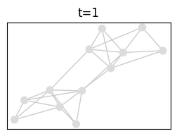
Let’s start by plotting the networks in timestep 1 (ts=1). First, using matplotlib, the default option.
[4]:
tn.plot_as_graph(generated_network_IG,ts=1,width=300,height=200)
/usr/local/lib/python3.7/site-packages/numpy/core/numeric.py:2327: FutureWarning: elementwise comparison failed; returning scalar instead, but in the future will perform elementwise comparison
  return bool(asarray(a1 == a2).all())
[4]:

Then, using bokeh and the auto_show option. It won’t work in google colab, see a solution below.
[5]:
tn.plot_as_graph(generated_network_IG,ts=1,width=600,height=300,bokeh=True,auto_show=True)
[5]:
One can plot in a new window (and/or in a file) by ignoring the auto_show option, and instead receiving a figure, that we can manipulate as usual with bokeh
[6]:
from bokeh.plotting import figure, output_file, show
fig = tn.plot_as_graph(generated_network_IG,ts=1,width=600,height=300,bokeh=True)
output_file("fig.html")
show(fig)
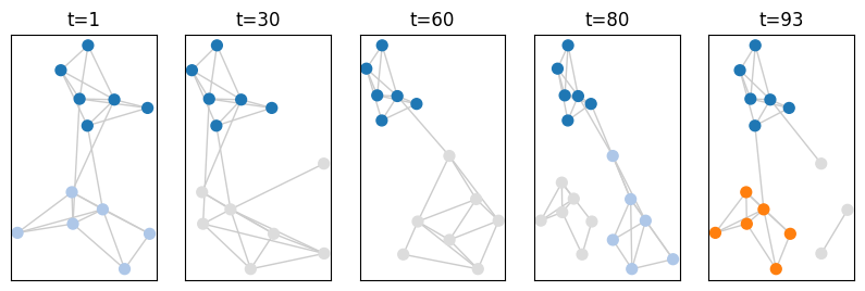
Instead of plotting a single graph, we can plot several ones in a single call. Note that in this case, the position of nodes is common to all plots, and is decided based on the cumulated network
[7]:
from bokeh.plotting import figure, output_file, show
fig = tn.plot_as_graph(generated_network_IG,ts=[1,30,60,80,generated_network_IG.end()-1],width=200,height=300)
/usr/local/lib/python3.7/site-packages/numpy/core/numeric.py:2327: FutureWarning: elementwise comparison failed; returning scalar instead, but in the future will perform elementwise comparison
  return bool(asarray(a1 == a2).all())

If we have dynamic communities associated with this dynamic graph, we can plot them too. Note that the same function accepts snapshots and interval graphs, but both the graph and the community structure must have the same format (SN or IG)
[8]:
from bokeh.plotting import figure, output_file, show
fig = tn.plot_as_graph(generated_network_IG,generated_comunities_IG,ts=[1,30,60,80,generated_network_IG.end()-1],auto_show=True,width=200,height=300)
Longitudinal Visualization
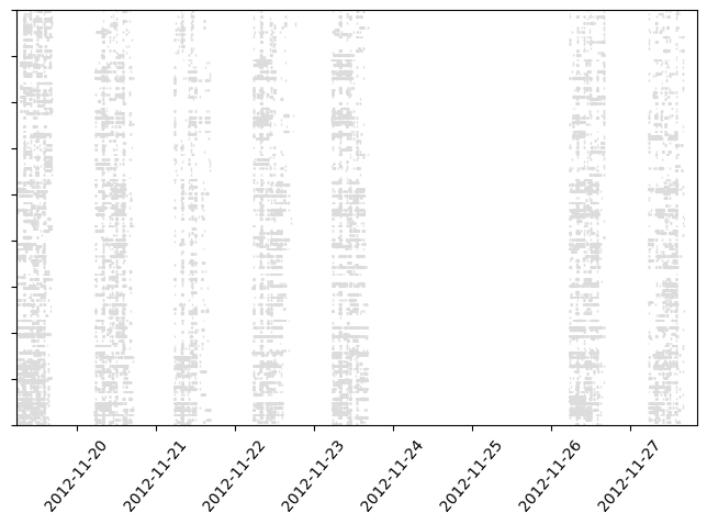
The second type of visualization plots only nodes and not edges.
Time corresponds to the x axis, while each node has a fixed position on the y axis.
It is possible to plot only a dynamic graphs, without communities. White means that the node is not present or has no edges
[9]:
plot = tn.plot_longitudinal(generated_network_IG,height=300)

Or only communities, without a graph:
[10]:
plot = tn.plot_longitudinal(communities=generated_comunities_IG,height=300)

Or both on the same graph. The grey color always corresponds to nodes whithout communities. Other colors corresponds to communities
[11]:
plot = tn.plot_longitudinal(generated_network_IG,communities=generated_comunities_IG,height=300)

It is possible to plot only a subset of nodes, and/or to plot them in a particular order
[12]:
plot = tn.plot_longitudinal(generated_network_IG,communities=generated_comunities_IG,height=300,nodes=["n_t_0000_0008","n_t_0000_0002"])

Timestamps
It is common, when manipulating real data, to have dates in the form of timestamps. There is an option to automatically transform timestamps to dates on the x axis : to_datetime
We give an example using the sociopatterns dataset
[14]:
sociopatterns = tn.graph_socioPatterns2012(format=tn.DynGraphSN)
graph will be loaded as: <class 'tnetwork.dyn_graph.dyn_graph_sn.DynGraphSN'>
[15]:
#It takes a few seconds
to_plot_SN = tn.plot_longitudinal(sociopatterns,height=500,to_datetime=True)
/usr/local/lib/python3.7/site-packages/numpy/core/numeric.py:2327: FutureWarning: elementwise comparison failed; returning scalar instead, but in the future will perform elementwise comparison
  return bool(asarray(a1 == a2).all())
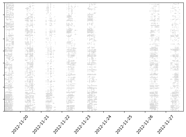
Snapshot duration
By default, snapshots last until the next snapshot. If snapshots have a fix duration, there is a parameter to indicate this duration : sn_duration
[16]:
#in sociopatterns, there is an observed snapshot every 20 seconds.
to_plot_SN = tn.plot_longitudinal(sociopatterns,height=500,to_datetime=True,sn_duration=20)
Bokeh longitudinal plots
Longitudinal plots can also use bokeh. It is clearly interesting to have ineractive plots in order to zoom on details or to check the name of communities or nodes. However, bokeh plots with large number of elements can quickly become unresponsive, that is why there are not used by default.
By adding the parameter bokeh=True, you can obtain a bokeh plot exactly like for the cross-section graphs, with or without the auto_show option.
[17]:
tn.plot_longitudinal(generated_network_IG,communities=generated_comunities_IG,height=300,bokeh=True,auto_show=True)
[17]:
[18]:
from bokeh.plotting import figure, output_file, show
fig = tn.plot_longitudinal(sociopatterns,bokeh=True)
output_file("fig.html")
show(fig)
[ ]: